When you’re viewing individual images in Lightroom’s Library, Develop, or Print modules, you can change the color of the area surrounding the image. “Color” is a little generous — the options are all neutral shades of gray, from white to black. But the choice is more useful than it might first appear.
The default is 50% medium gray, which works well for general editing. But there are practical reasons to change it. When I’m doing white-background product shots, I switch to white so that any edge shadows or vignettes become immediately visible — it’s much easier to spot problems that way. White is also useful if you’re prepping a print you know will be matted in white, or if you want to verify that your blacks are genuinely black rather than very dark gray. A black background, on the other hand, can help images with bright highlights feel more dramatic and reduces eye-catching interface clutter. My general default is dark gray, but that’s personal preference more than anything else.
How to change the background color
There are two ways to do it. The quickest: make sure you’re in the Library module’s single-image (Loupe) view, or in the Develop or Print module, then right-click anywhere in the area surrounding the image. A small context menu appears with the available options.
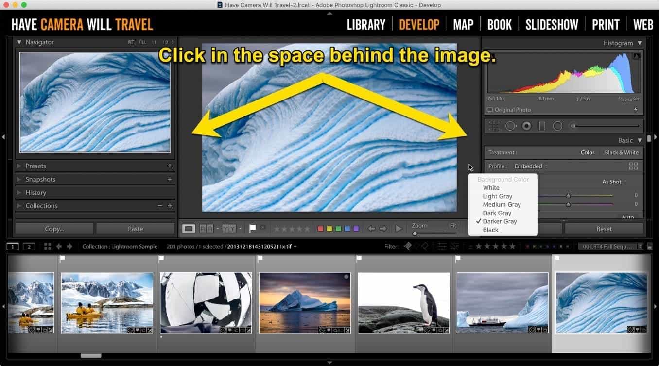
If you want to set a permanent default rather than just a one-off change, go to Preferences > Interface tab > Background > Fill Color (Mac: Lightroom menu > Preferences; Windows: Edit > Preferences). The same set of options is there, and whatever you choose becomes the persistent default going forward.1
Note that the right-click method doesn’t work in the Grid (thumbnail) view — you need to be in single-image view first. Press E to switch to Loupe view if needed.
The options
There are six choices, all shades of gray:
White

Light gray

Medium gray

Dark gray

Darker gray

Black

Things worth knowing
This is an application-level setting, not a per-image one. Whatever you set applies to every image you view — you can’t assign a different background to individual photos.
It works in the Library module’s single-image (Loupe) view, the Develop module, and the Print module. It doesn’t work in the Library Grid view — the grid has its own cell styling controlled separately via View > View Options.
In the Print module, the background fill color applies to the area surrounding the virtual paper. The paper itself has its own drop shadow option, which is a separate control in the Image Settings panel under Print — that’s independent of the background color.
If you’re running a dual-monitor setup, Lightroom lets you set the background fill color for the secondary display window independently. That setting is in Preferences > Interface > Background > Secondary Window Fill Color — it’s separate from the main window setting, so you can have different backgrounds on each display if that suits your workflow. Useful if your second monitor is primarily used for full-screen image review and you want a different neutral tone there than in your main editing view.2
The options are limited to shades of gray — there’s no color picker for red, blue, or anything else. That’s intentional, and it goes deeper than just convention. The human visual system is highly context-sensitive: the colors and tones surrounding an image directly influence how we perceive the image itself, a phenomenon called simultaneous contrast. A colored surround can shift your perception of hues within the image, making neutral tones appear to take on a color cast, and making accurate color judgments genuinely unreliable. Keeping the surround neutral eliminates that variable.3
The choice of which neutral gray matters too. A very light surround can make shadows in the image appear deeper than they are; a very dark surround can make highlights appear brighter. Medium gray — Lightroom’s default — is the standard used in professional color-managed environments and is specified by ICC workflow guidelines as a neutral viewing condition precisely because it sits far enough from both extremes to minimize those perceptual biases. That said, the “correct” choice for editing purposes is the one that most closely matches the environment where your final image will be displayed — which is why white makes practical sense when you’re preparing an image that will be printed on white paper or displayed on a white web page background.
If you also use Lightroom’s Lights Out mode (press L to cycle through Normal, Lights Dimmed, and Lights Out), note that the Lights Out screen color is a separate setting — it’s in Preferences > Interface > Lights Out > Screen Color, not the right-click menu. By default it goes to black, but you can change it to white if you want a quick way to preview how an image looks against a white background without switching to Soft Proofing mode.
Notes & References:
- Evening, Adobe Photoshop Lightroom Classic CC Book, 2019, p. 14; Bampton, Lightroom — The Missing FAQ, 2015, p. 84. [↩︎]
- Evening, 2019, p. 14, Figure 1.11. [↩︎]
- Nelson, Photographer’s Guide to Color Management, 2007, p. 61: viewing images against a neutral gray surround is a fundamental principle of color-managed workflows, specifically because it prevents the surround from inducing color shifts in perceived image tones. [↩︎]